- UI/UX
- Development
Retro
Retro is a refurbished designer retailer operating in one of the fastest-growing segments of fashion e-commerce: the resale and recommerce market, where sustainability meets style and the audience is as brand-literate as any luxury buyer. The platform curates pre-owned sneakers and accessories, offering buyers access to coveted pieces at accessible prices without compromising on quality or authenticity. When Retro came to Scale Studios, the core challenge was a perception one as much as a design one: refurbished products carry a stigma that the wrong digital experience can reinforce instantly. The brief was to build something that felt unambiguously premium; an e-commerce experience that positioned Retro not as a discount destination but as a curated platform with taste, authority, and a genuine point of view on the future of fashion retail.
- Client
- Retro
- Year
- 2026
Positioning Through Design
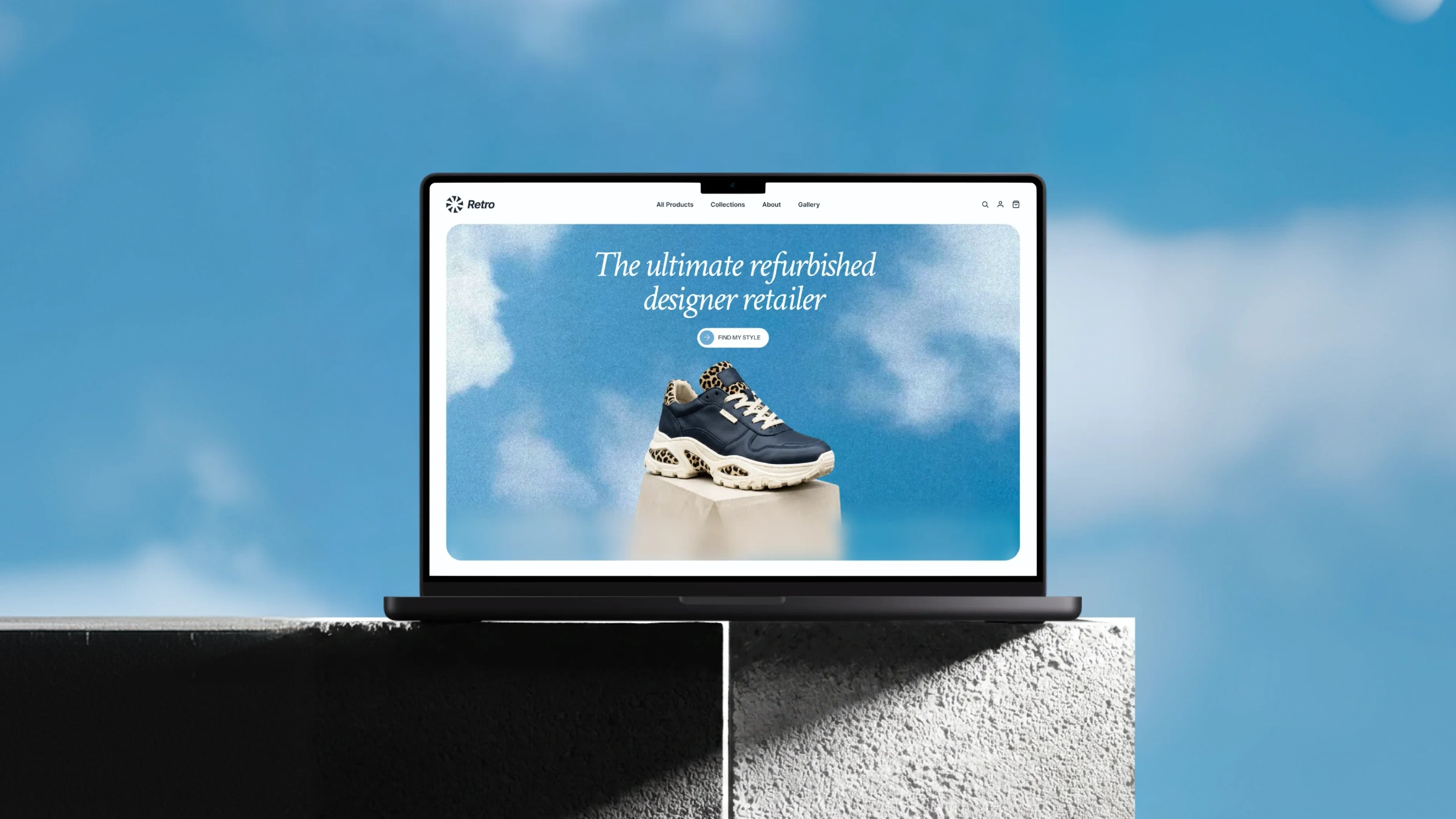
The design language was the first and most important decision. A refurbished retailer that looks refurbished has already lost. Retro needed to look like a brand that happened to sell pre-owned, not a resale marketplace that was trying to look like a brand. We built the visual system around a sky blue palette: fresh, confident, and distinctly un-discount, paired with clean white surfaces and editorial-style product photography that treats each sneaker as an object worth desiring.
The hero leads with "The ultimate refurbished designer retailer", a statement of category ownership, not an apology for the product type.
Typography was set with the same confidence. Clean, unhurried, and at a scale that says the brand knows its worth. The "Find My Style" CTA was positioned as an invitation rather than a push, drawing the user into a discovery experience rather than a transaction.
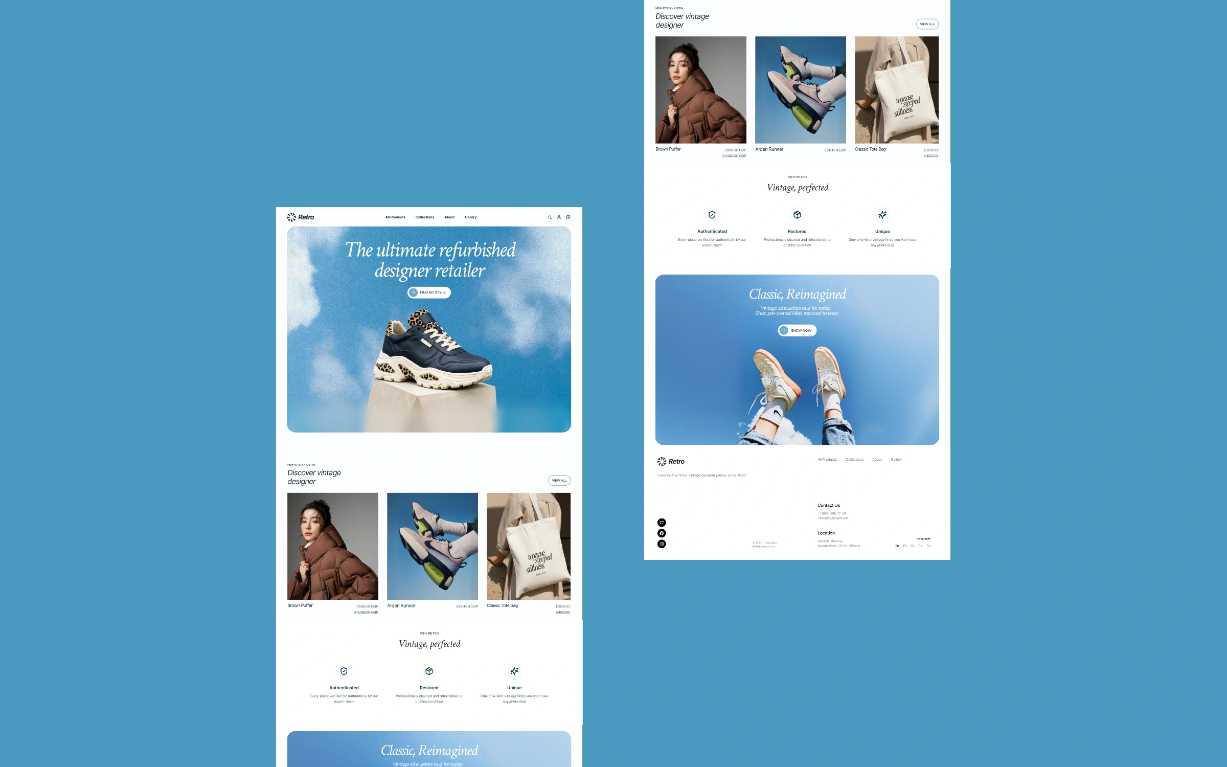
The Browsing and Discovery Experience
Retro's product range has a curation logic that a standard e-commerce grid would flatten. The site was designed to surface that curation, presenting collections, designers, and categories in a way that reflects the taste behind the selection rather than simply listing inventory. The collections page was given editorial treatment: each designer grouping was introduced with context, each product page built to showcase condition, provenance, and detail with the same care a luxury retailer would give a new piece.
Filtering was designed around the way Retro's audience actually shops: by brand, silhouette, and era as much as by size and price. The browsing experience rewards exploration, which is the behavior a recommerce platform needs to encourage to build the kind of session depth that leads to conversion.
Development Built for Trust
In recommerce, trust is a technical requirement as much as a design one. Buyers need to feel confident in what they're purchasing, and the platform needs to support that confidence at every step. Product pages were built with detailed condition grading, authentication information, and high-resolution image galleries that show every angle and every detail. The checkout flow was built for clarity: no hidden fees, no ambiguous states, and a confirmation experience that reassures the buyer they've made a good decision.
The backend was structured to handle a constantly rotating inventory; new listings, sold-out pieces, and seasonal drops, without requiring a rebuild of the browsing experience each time.
The mobile experience was treated with the same seriousness as desktop, because Retro's audience discovers and purchases across both surfaces interchangeably.