- UI/UX
- Development
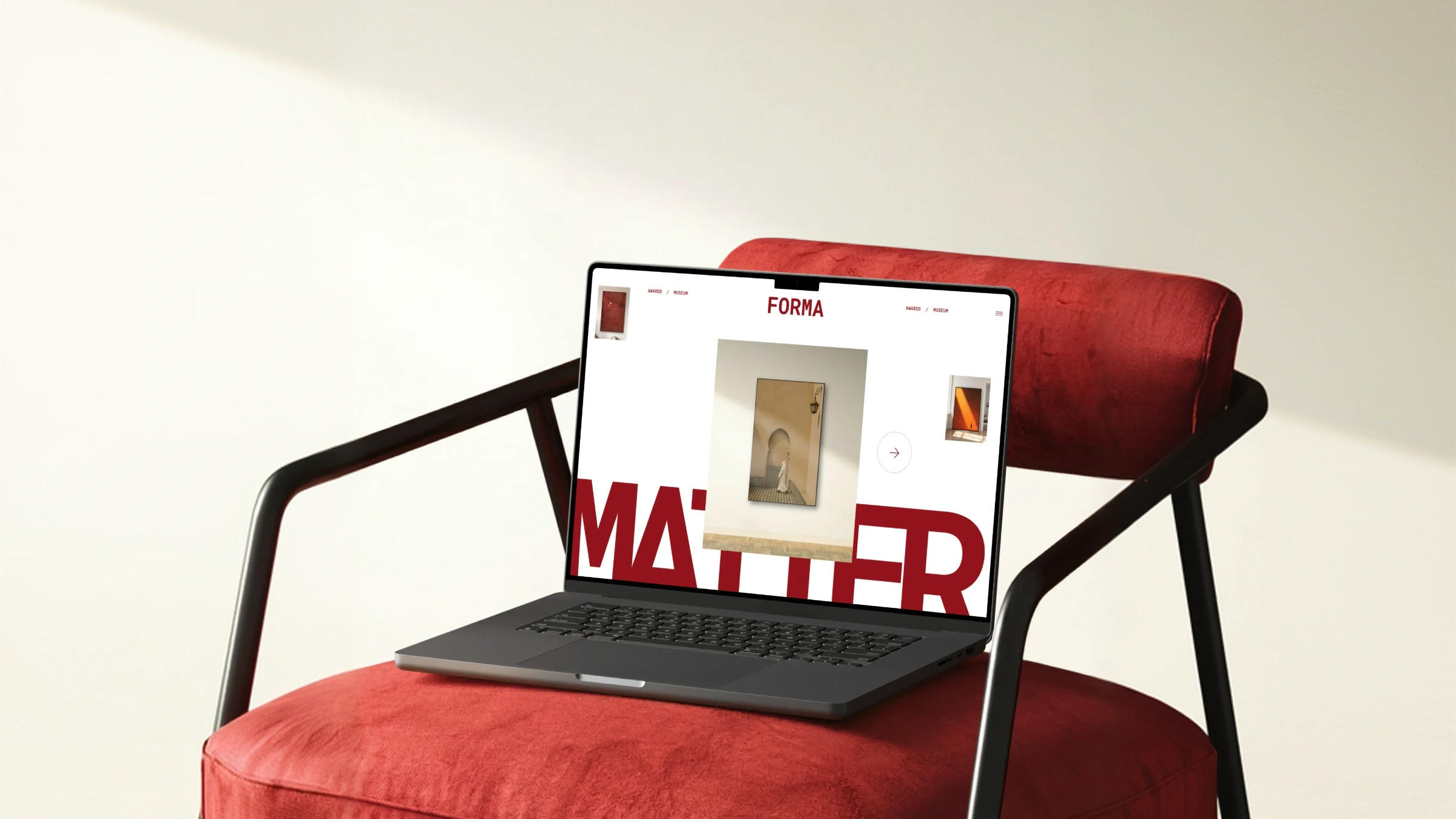
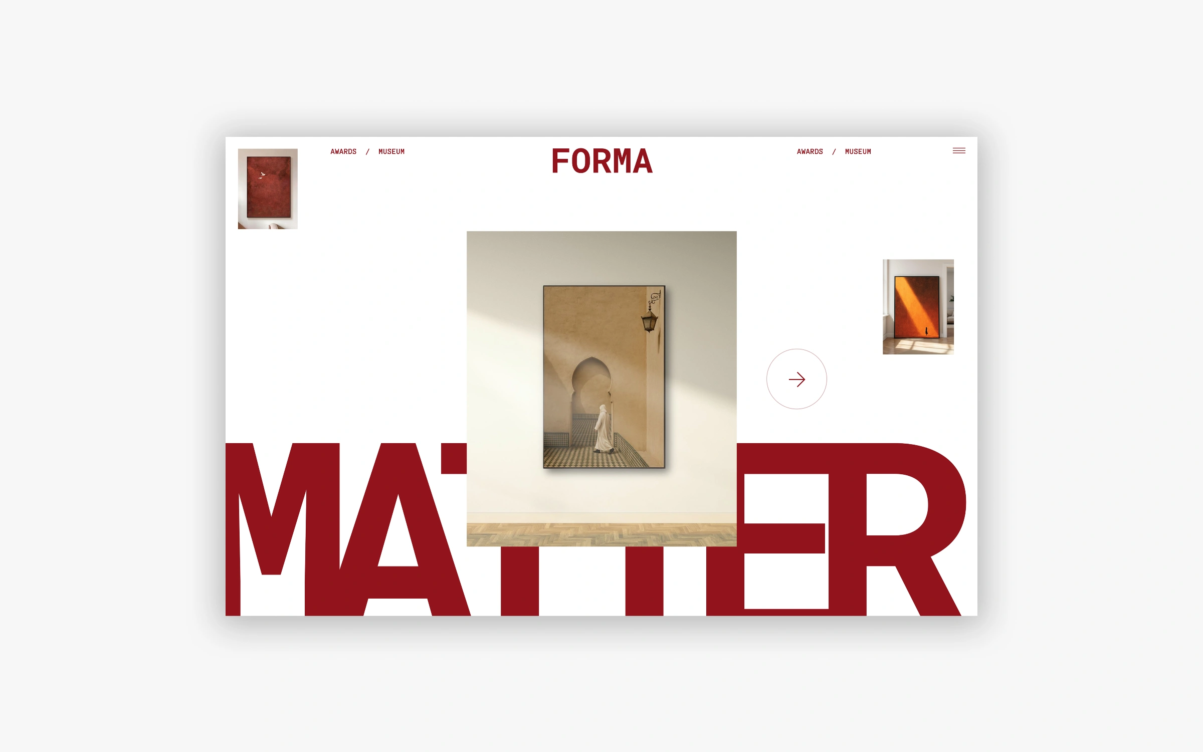
Forma
An editorial web experience built around the power of type. Forma is a creative and cultural brand whose entire identity is built around the primacy of form: the idea that how something looks is inseparable from what it means. The brand operates in the space where design, art, and culture overlap, with an audience that has a sharp eye and very little tolerance for anything that feels generic or templated. When Forma came to Scale Studios, they had a strong visual identity and a clear sense of who they were, but a digital presence that wasn't living up to either. The ask wasn't just a new website. It was a digital experience that could hold its own against the brand's ambition: something that felt like a publication, moved like a creative studio's portfolio, and communicated authority in the culture space without saying a word about it directly.
- Client
- Forma
- Year
- 2026
The Design Approach
We stripped the interface back to its essentials: a dominant display typeface, a restrained grid, and a whitespace used with intention. Navigation is minimal enough that the work speaks without competition.
Typography was never decorative here; it was structural. Every heading, every label, every line break was a layout decision as much as a writing one.
How It's Built
Scroll-based reveal animations give the oversized type its cinematic entrance without adding render weight. Font loading was handled carefully to eliminate layout shift, a common failure point on type-heavy builds. The mobile experience holds the same visual drama at every breakpoint.
The Outcome
A digital presence that positions Forma exactly where it belongs: alongside the culture it's part of, not beneath it.